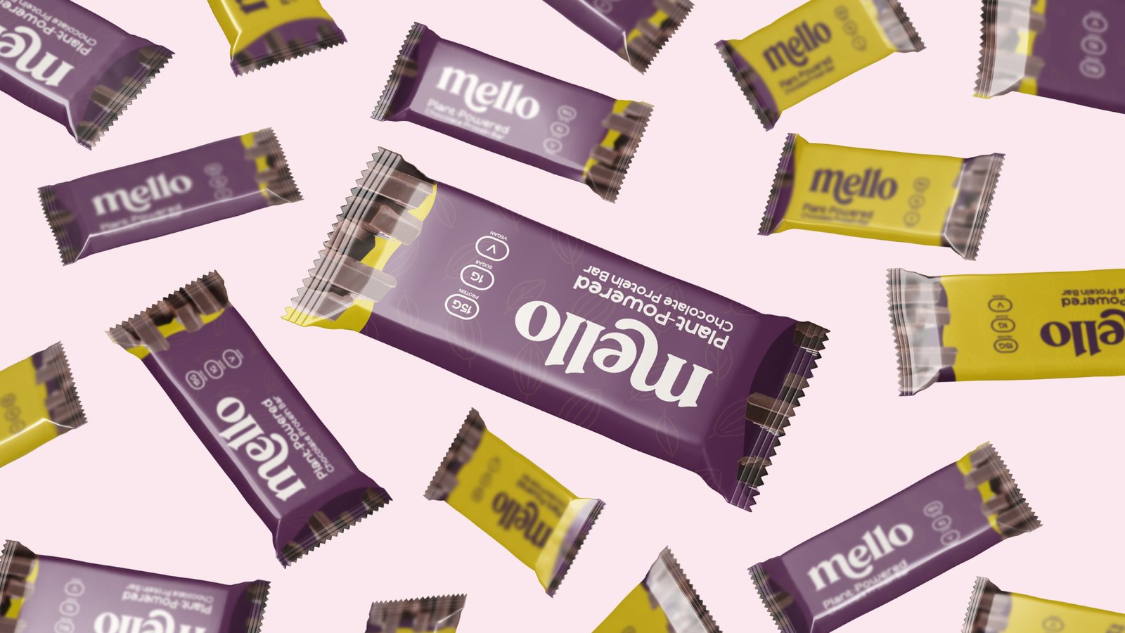
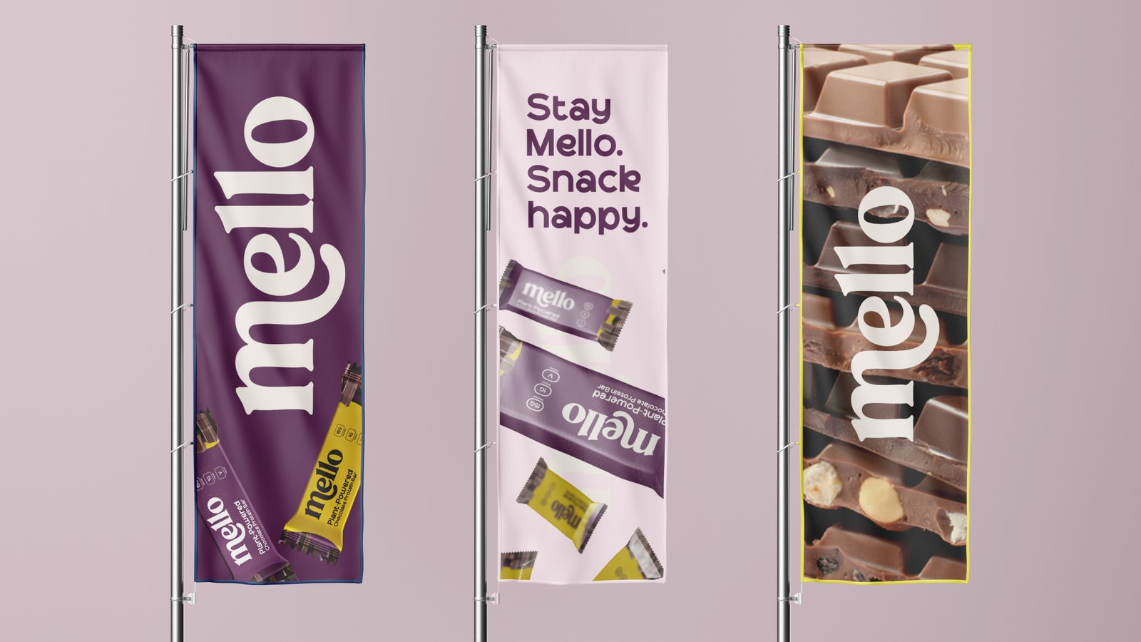
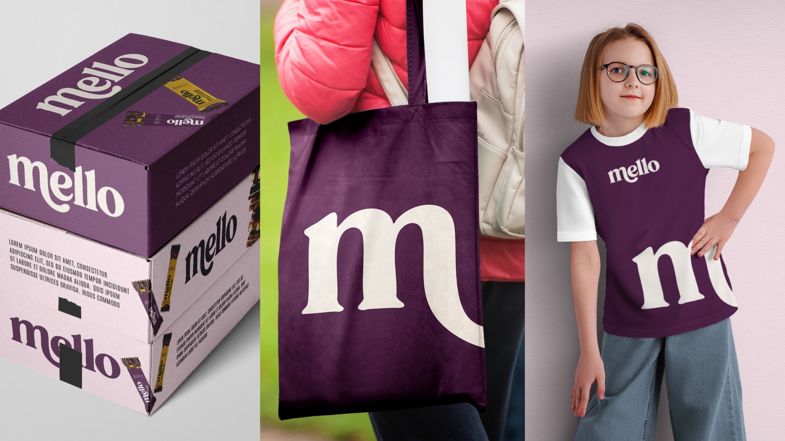
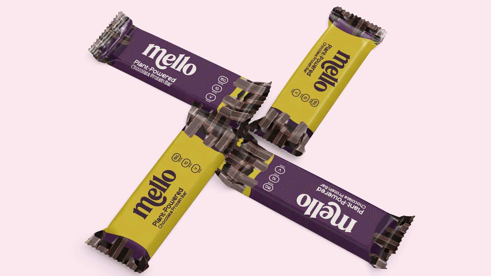
Mello is a vibrant chocolate brand created to bring joy, comfort, and a little sweetness to everyday moments. Designed with a playful yet premium identity, the brand combines bold typography, rich chocolate-inspired colours, and modern packaging.
Overview
Mello is a vibrant chocolate brand created to bring joy, comfort, and a little sweetness to everyday moments. Designed with a playful yet premium identity, the brand combines bold typography, rich chocolate-inspired colours, and modern packaging.
Team
-

Product Designer
Avery Monroe
-

iOS Dev
Avery Monroe
-

Android Dev
Finley Rhodes
-

Design Lead
Kai Emerson
Deliverables
- Brand Identity
- Logo Design
- User Interface Design
- Interactive Prototypes
- Color, Typography, and Iconography Guidelines
Project Overview
The Mello branding project was developed to establish a memorable identity for a modern chocolate and snack brand.
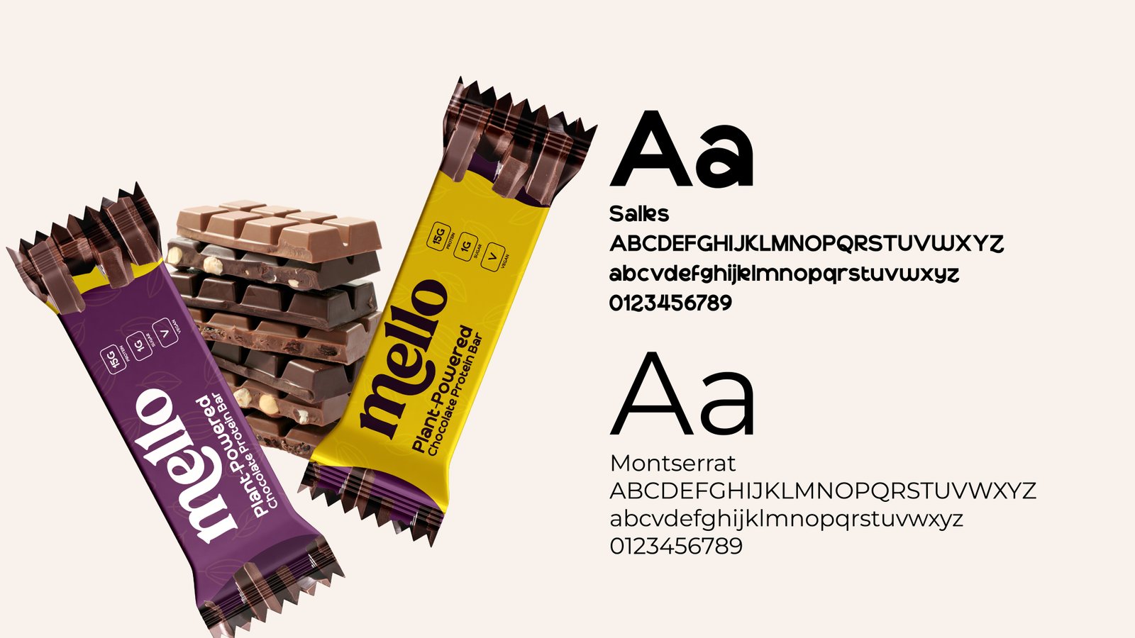
Brand Overview
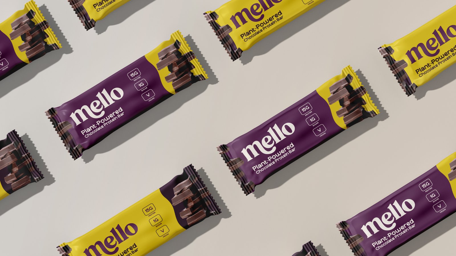
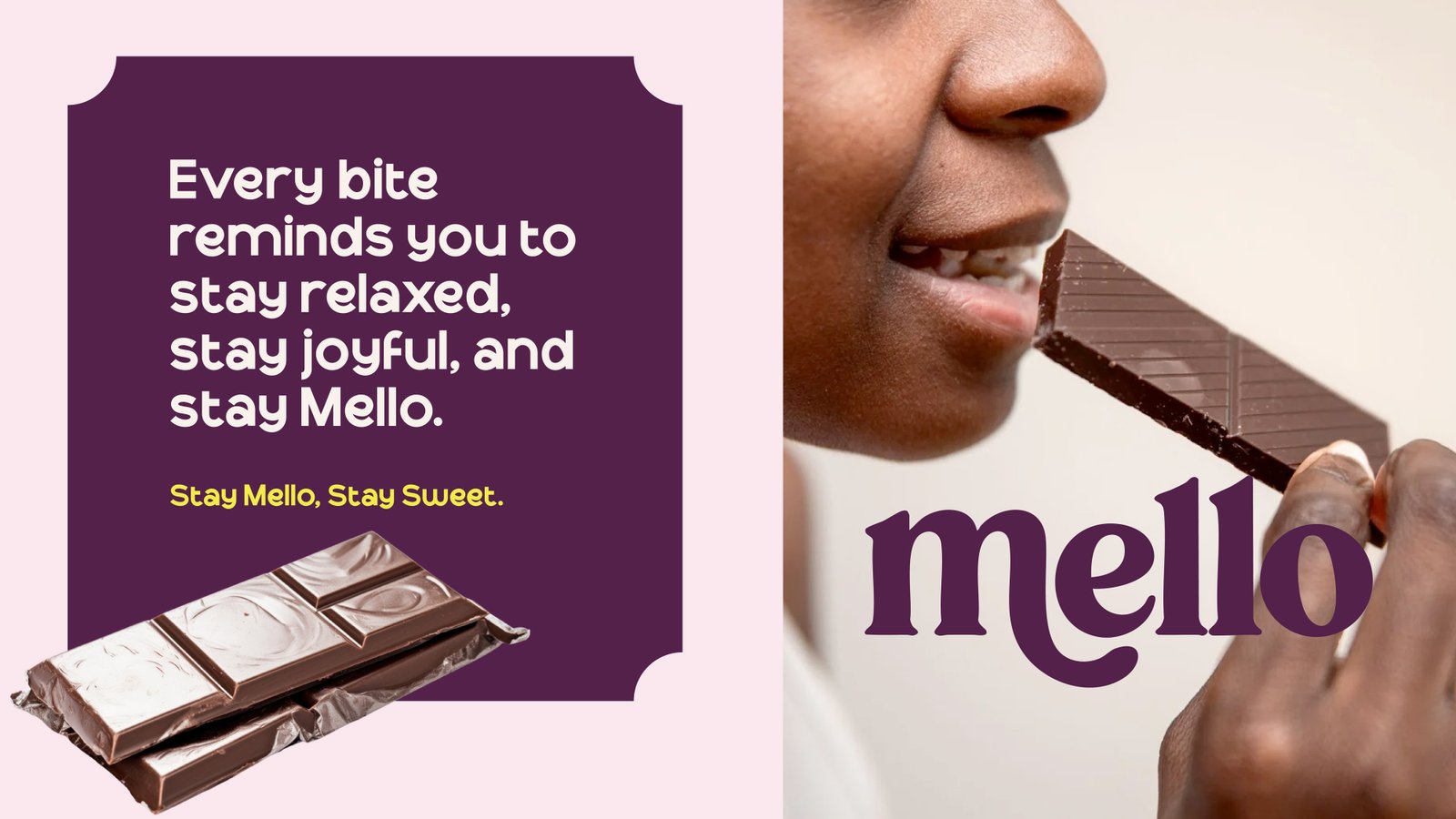
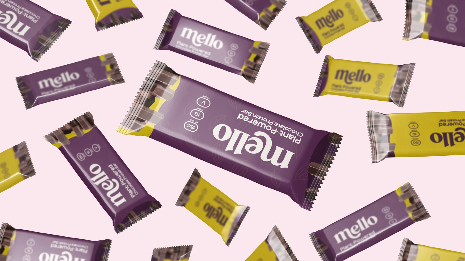
This project showcases the complete brand development—from logo creation and packaging design to colour systems, typography, merchandise, promotional assets, and marketing applications.
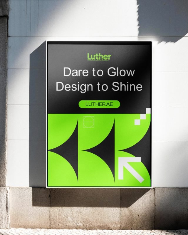
Luther — Brand Identity
A modern branding project for Luther, an International Marketing Management company, featuring a…
Auréa Café – Visual Experience
Auréa Café was created as a premium coffee brand inspired by warmth, comfort, and authentic café…
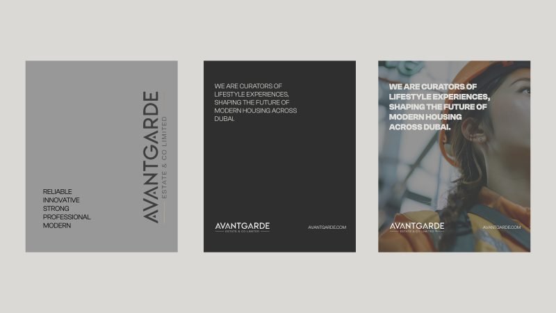
Avantgarde Estate & Co Limited – Modern Construction
The goal of this branding project was to create a refined visual identity that reflects the…
Réel Coffee — Coffee Brand Identity
Réel Coffee was created to establish a memorable and premium coffee experience through thoughtful…
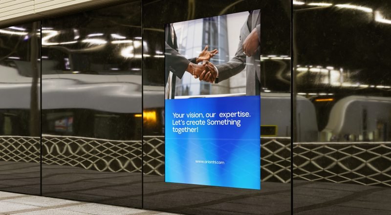
Orion Holding Limited – Corporate Brand Identity
Orion Holding Limited is a forward-thinking corporate holding company focused on delivering…
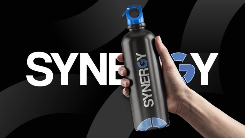
Synergy — Brand Visual Direction
Synergy is a modern corporate identity designed for a business consulting company. The project…
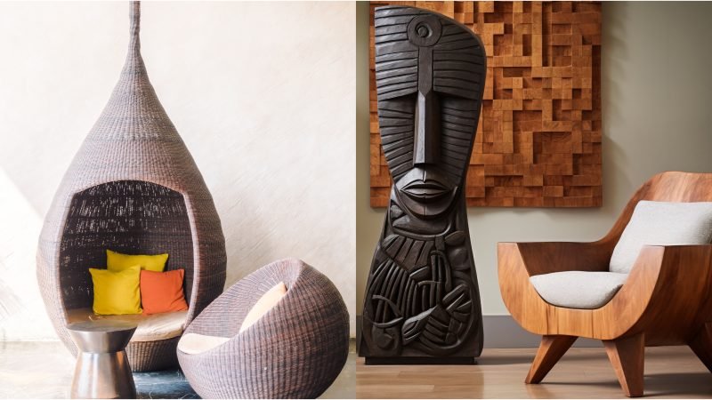
Olif Distribution Interior Design
Olif Distribution Interior Design was developed as a sophisticated brand identity for a modern…
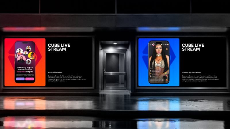
Cube Live Stream – Live Streaming Platform
Cube Live Stream is a next-generation social platform that combines live streaming, real-time…
FAQ
Mello is a fictional plant-powered chocolate brand developed as a complete branding and packaging design project.
Ask a questionWhat inspired the Mello brand?
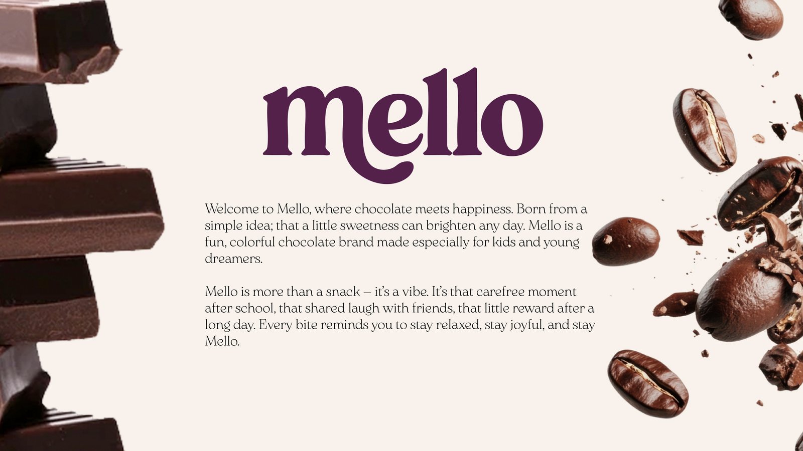
The brand was inspired by the idea that chocolate is more than a snack—it's a small moment of happiness. The identity reflects warmth, joy, comfort, and positivity through bold colours, playful typography, and premium packaging.
Who is the target audience?
Mello is designed for chocolate lovers of all ages, with a strong appeal to young adults, families, and consumers looking for fun, premium-quality snacks with a modern personality.
Why were purple and yellow chosen as the primary colours?
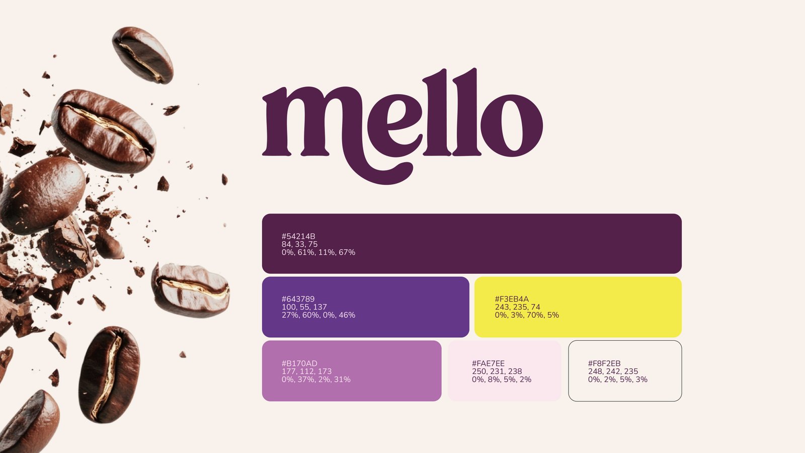
The rich purple represents indulgence, creativity, and premium quality, while the vibrant yellow communicates happiness, energy, and optimism. Together they create a bold, highly recognisable brand identity.
What makes this branding unique?
Mello combines expressive typography, vibrant packaging, emotional storytelling, and a consistent visual system that creates a memorable consumer experience across packaging, advertising, merchandise, and digital media.
Is this a real commercial brand?
This project was created as a brand identity and packaging design case study to demonstrate branding strategy, creative direction, and visual identity development.
