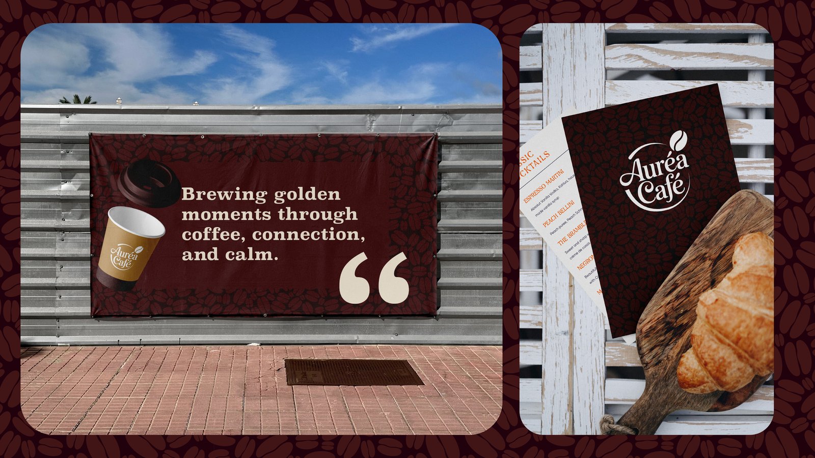
Auréa Café was created as a premium coffee brand inspired by warmth, comfort, and authentic café experiences. Every aspect of the identity was carefully designed to evoke the feeling of enjoying handcrafted coffee in a welcoming environment where every detail matters.
Overview
Auréa Café was created as a premium coffee brand inspired by warmth, comfort, and authentic café experiences. Every aspect of the identity was carefully designed to evoke the feeling of enjoying handcrafted coffee in a welcoming environment where every detail matters.
Team
-

Product Designer
Avery Monroe
-

iOS Dev
Avery Monroe
-

Android Dev
Finley Rhodes
-

Design Lead
Kai Emerson
Deliverables
- Brand Identity
- Logo Design
- User Interface Design
- Interactive Prototypes
- Color, Typography, and Iconography Guidelines
Project Overview
The Auréa Café branding project focused on creating a complete visual identity for a modern artisan café that values quality, comfort, and community. From logo development to packaging.
Brand Overview
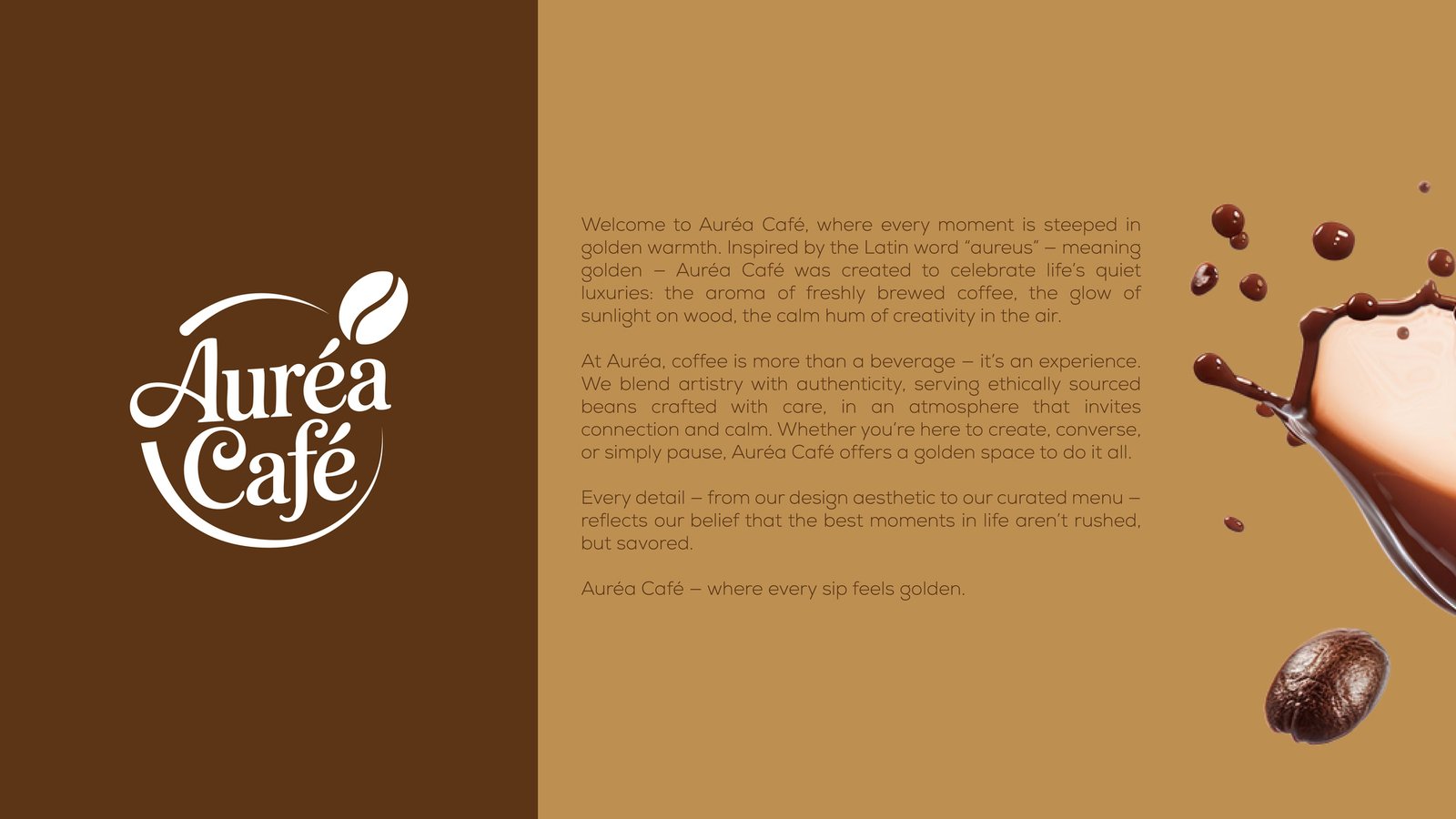
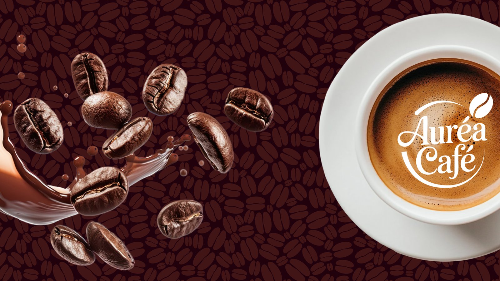
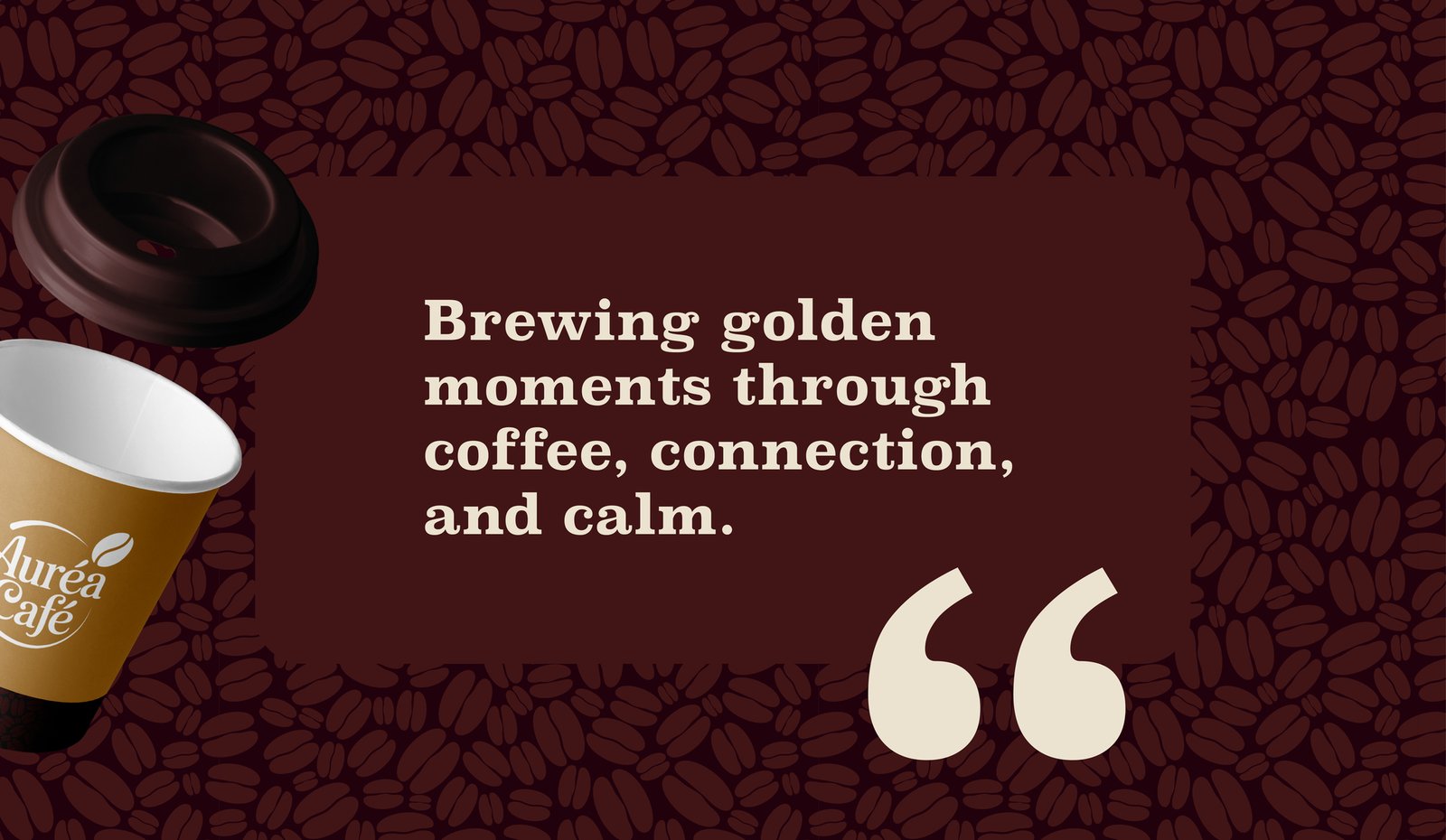
Auréa Café represents more than a place to enjoy coffee—it embodies a lifestyle centered around meaningful moments, exceptional craftsmanship, and genuine human connection. Inspired by the Latin word Aureus, meaning "golden" .
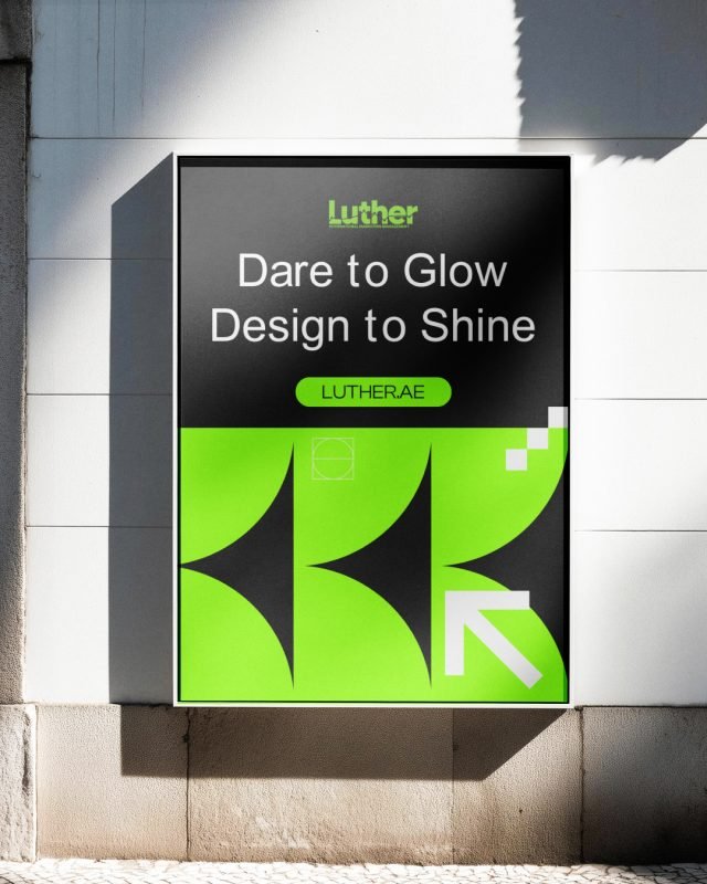
Luther — Brand Identity
A modern branding project for Luther, an International Marketing Management company, featuring a…
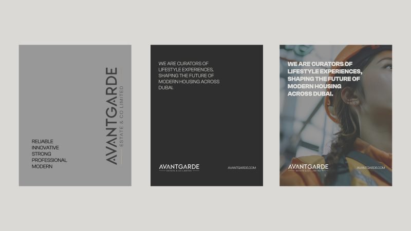
Avantgarde Estate & Co Limited – Modern Construction
The goal of this branding project was to create a refined visual identity that reflects the…
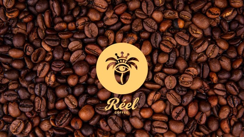
Réel Coffee — Coffee Brand Identity
Réel Coffee was created to establish a memorable and premium coffee experience through thoughtful…
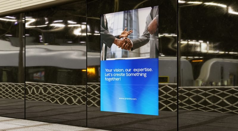
Orion Holding Limited – Corporate Brand Identity
Orion Holding Limited is a forward-thinking corporate holding company focused on delivering…
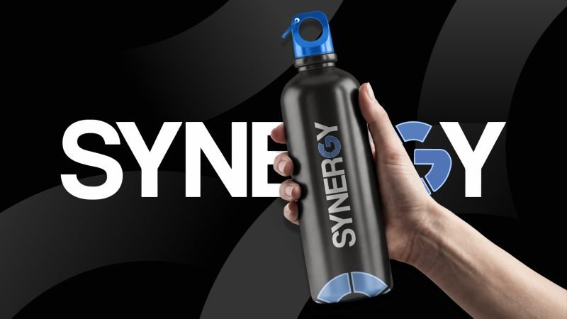
Synergy — Brand Visual Direction
Synergy is a modern corporate identity designed for a business consulting company. The project…
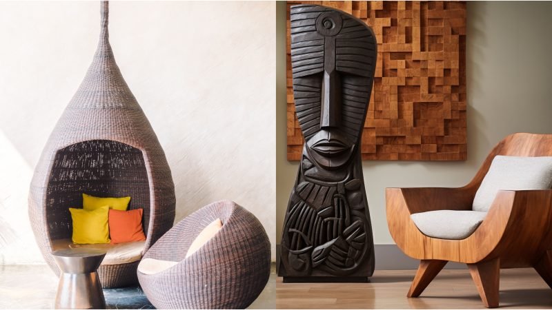
Olif Distribution Interior Design
Olif Distribution Interior Design was developed as a sophisticated brand identity for a modern…
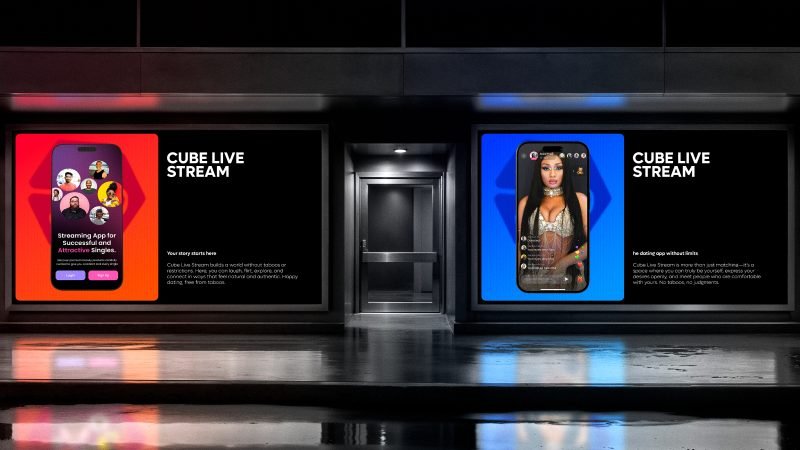
Cube Live Stream – Live Streaming Platform
Cube Live Stream is a next-generation social platform that combines live streaming, real-time…
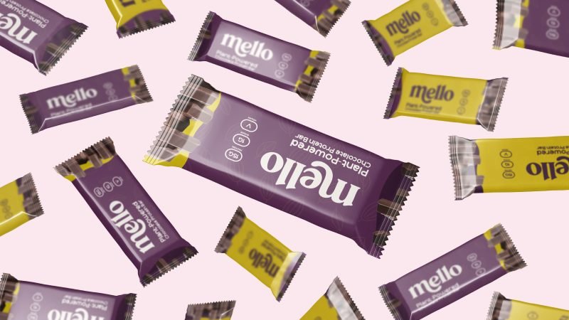
Mello – Brand Identity & Packaging Design
Mello is a vibrant chocolate brand created to bring joy, comfort, and a little sweetness to…
FAQ
Curious about the creative process behind Auréa Café? Here are some of the most common questions about the branding strategy, visual identity, and design decisions that shaped the project.
Ask a questionWhat was the main objective of the Auréa Café branding project?
The goal was to create a premium café identity that communicates warmth, quality, authenticity, and memorable customer experiences while maintaining a timeless and elegant visual style.
What inspired the Auréa Café visual identity?
The identity draws inspiration from artisan coffee culture, natural textures, warm earthy tones, handcrafted traditions, and the meaning of the word Aureus—representing warmth, richness, and golden moments.
What branding materials were created?
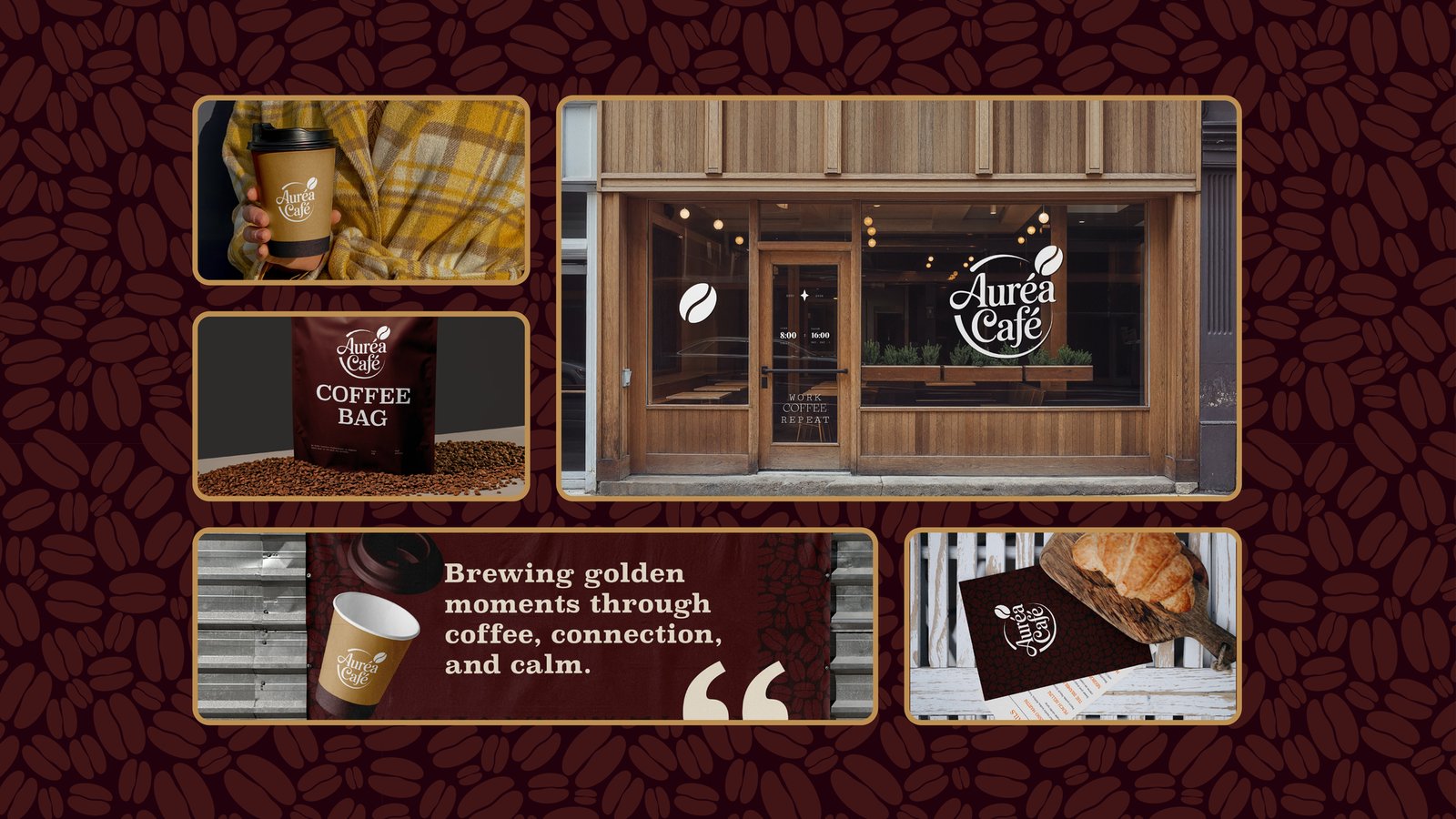
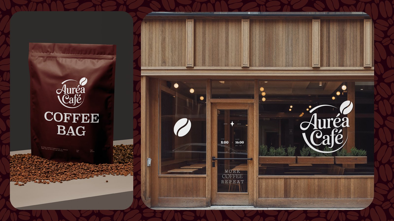
The project included logo design, coffee packaging, takeaway cups, storefront signage, menus, promotional banners, printed collateral, and various branded customer touchpoints.
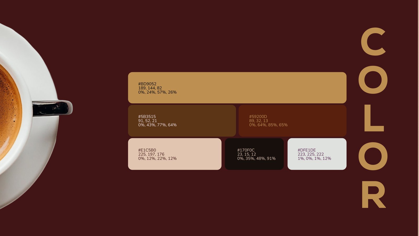
Why were earthy brown and gold colors chosen?
These colors symbolize premium roasted coffee beans, comfort, craftsmanship, elegance, and warmth while creating a welcoming atmosphere that customers immediately associate with quality coffee.
How does the branding improve the customer experience?
By maintaining a consistent visual identity across every interaction—from entering the café to holding a takeaway cup—the branding strengthens recognition, builds trust, and creates memorable experiences that encourage customer loyalty.
