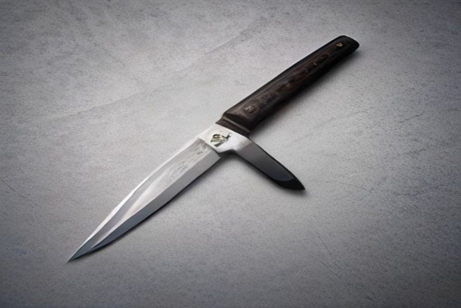
When a venerable brand like ARTISAN announces a new iteration of its flagship pocket knife, the industry pays close attention. The 2026 release of the Orthodox V2 brings a subtle yet decisive shift: a straight‑razor‑inspired blade profile that feels both nostalgic and forward‑leaning.
A New Chapter in Knife Design
The original Orthodox series was celebrated for its rugged, utilitarian edge—perfect for fieldwork and everyday carry. The V2’s straight‑razor contour, however, introduces a cleaner line that echoes the precision of shaving blades. This aesthetic pivot is more than a visual tweak; it signals a deeper commitment to ergonomic harmony.
In practice, the blade’s flattened edge reduces friction, allowing for smoother cuts on a variety of materials. The handle, reworked with a softer, textured polymer, offers a secure grip that feels natural in both left‑ and right‑handed users. These changes reflect a growing trend in product design: marrying heritage forms with human‑centered engineering.
Why the Update Resonates With Modern Brands
Brands today are not just selling tools—they are selling experiences. The Orthodox V2’s design speaks directly to that narrative. Its straight‑razor shape conveys precision and craftsmanship, qualities that resonate in high‑end fashion, automotive, and tech markets alike. Moreover, the knife’s balanced weight distribution and minimalist silhouette make it a compelling case study for designers who wish to embed functionality within sleek visual language.
- Heritage Meets Innovation: The blade’s profile nods to traditional straight‑razor tools while integrating contemporary manufacturing tolerances.
- Ergonomic Excellence: A handle that adapts to natural hand curves reduces fatigue, a key consideration in user experience research.
- Brand Narrative: The knife’s understated elegance positions it as a symbol of disciplined craftsmanship—ideal for storytelling in marketing campaigns.
- Cross‑Industry Appeal: Its design language translates well into apparel, accessories, and digital interfaces that favor clean lines and tactile confidence.
For creative studios, the V2 offers a tangible example of how materiality can reinforce brand identity. The knife’s matte finish, paired with its precise geometry, creates a visual hierarchy that designers can emulate in UI elements, packaging, and even web typography.
Design Takeaway for Creative Studios
What can designers glean from ARTISAN’s approach? The answer lies in intentional simplification. By stripping away extraneous ornamentation, the V2 highlights form and function. This principle can be translated into digital products: prioritize user flow, reduce visual noise, and anchor interactions around a central, well‑crafted element.
Concrete takeaway: When redefining a product line, focus on a single, bold design statement that encapsulates both heritage and modernity. The Orthodox V2 demonstrates that a single shape change—a straight‑razor blade—can re‑energize a brand’s portfolio, attract a new audience, and reinforce its core values.
In sum, ARTISAN’s update is more than an incremental tweak; it’s a strategic move that blends artisanal heritage with ergonomic science. For designers, marketers, and brand strategists, the knife serves as a reminder that thoughtful form can drive both functional performance and emotional resonance.